‘Pantone® provides a universal language of color that enables color-critical decisions through every stage of the workflow for brands and manufacturers.’
– Taken from the first line on Pantone®’s ‘About Us’ page
At Muxette, we are constantly on the lookout to introduce new designs and concepts to our clients. Beyond that, we thrive on being up-to-date with industry trends and strive to incorporate them when appropriate. Today, we will be sharing our take on the Pantone® Fashion Top 10 Color Trend Report created by the Pantone® Color Institute.
In no particular order here are the colors that are in:
#1 Pantone® 12-0740, Limelight
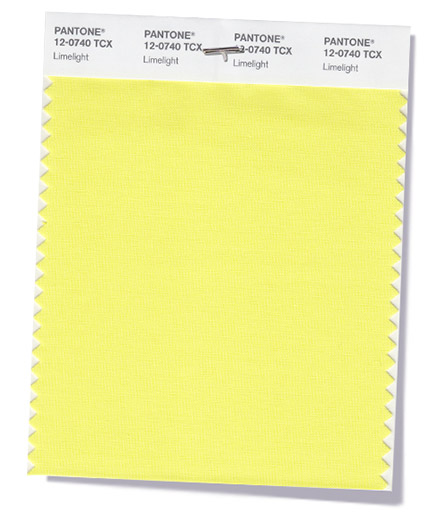
Source: Pantone®
Pantone® Short Description:
Animated and effervescent, a pungent yellow-green becomes the center of attention.
Our Take:
One of the two non-traditional choices, Limelight, as its own name suggests, is stepping out. This yellow is elegant and can be used to attract immediate attention. Want to stand out even more? Put it beside another bright color and heighten the spirit of youth and longevity!
#2 Pantone® 19-1536, Red Pear
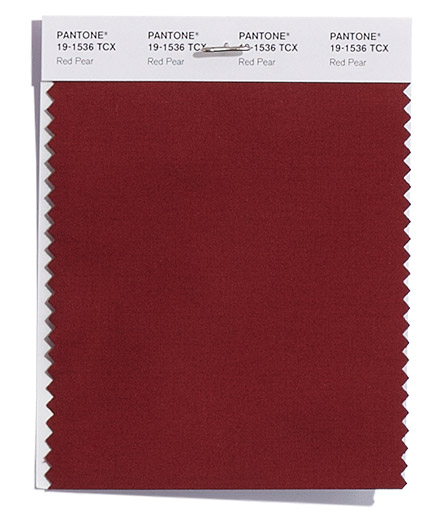
Source: Pantone®
Pantone® Short Description:
Deliciously deep red, whose luscious depth entices.
Our Take:
Just like good red wine, it has aged well. With its many layers, this burgundy-like color is complex and has a solid presence. If you are searching for a color to represent class and maturity, look no further for Red Pear.
#3 Pantone® 18-1549, Valiant Poppy
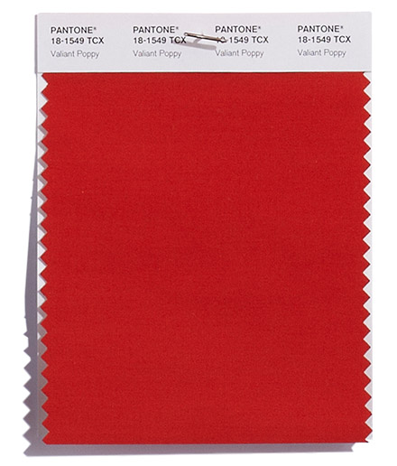
Source: Pantone®
Pantone® Short Description:
Brave and outgoing red shade effusive in its allure.
Our Take:
We can feel the energy; contained yet growing. It is bold and striking, so consider either using it in moderation, or going all out – there is no inbetween. This red seeks those who are daring and desire to have their voices heard.
#4 Pantone® 16-1255, Russet Orange
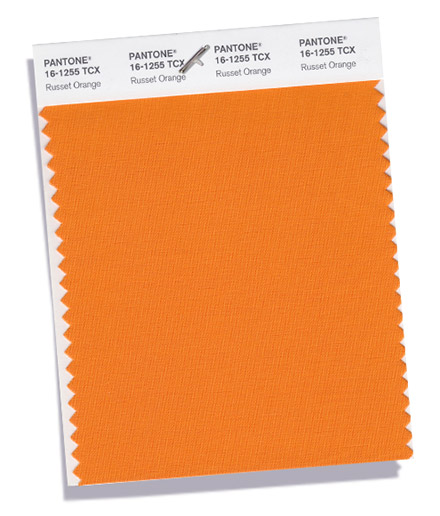
Source: Pantone®
Pantone® Short Description:
This forest floor orange speaks to earthen warmth.
Our Take:
To us, Russet Orange brings a certain sense of everything going well. It is fun and serious at the same time, vibrant, and very positive. Frank Sinatra once said, “Orange is the happiest color.”. Do you agree? We do!
#5 Pantone® 16-1255, Ceylon Yellow

Source: Pantone®
Pantone® Short Description:
Savory and spicy yellow adds an exotic touch.
Our Take:
Ceylon Yellow may not stand out like some of the brighter colors in this list, but it has its place. It does not seek attention, but helps in building a rich story. When we see Ceylon Yellow, we see ‘Oriental’. Powerful but not aggressive.
#6 Pantone® 18-0625, Martini Olive

Source: Pantone®
Pantone® Short Description:
Smooth, sophisticated and urbane green adds depth to the rest of the palette.
Our Take:
The sleekest of the lot, Martini Olive oozes subtle confidence and character. If it were a person, Martini Olive would be that cool friend of yours that always seems to have everything in control.. and more.
#7 Pantone® 15-3520, Crocus Petal
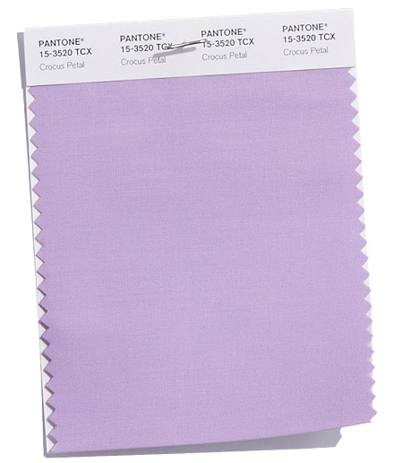
Source: Pantone®
Pantone® Short Description:
A cultivated and refined hue adds a light and airy spring-like feeling demand.
Our Take:
According to Pantone®, this color is one of the other notable non-traditional choices to make the Fall/Winter list – and we are glad it did. It looks and smells so wonderfully fragrant; its name, Crocus Petal, only further emphasizes it. This color is approachable and simple to pair with.
#8 Pantone® 18-4048, Nebulas Blue
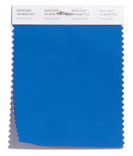
Source: Pantone®
Pantone® Short Description:
Reminiscent of twilight, a thoughtful, starry-eyed blue.
Our Take:
Comforting and reassuring, Nebulas Blue is a sure winner when it comes to making impressions. As with all blues, you can expect a cool and peaceful persona. Nebulas Blue is the friend you trust the most to keep a secret.
#9 Pantone® 18-5025, Quetzal Green

Source: Pantone®
Pantone® Short Description:
A deep elegant blue-green hue suggestive of rich plumage.
Our Take:
This blend of green and blue gave us a sense of vast opportunity, abundance and never-ending potential. Aptly named after the feathers of the vivid Quetzal, Quetzal Green is easily paired with other colors.
#10 Pantone® 18-3838, Ultra Violet
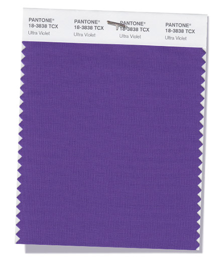
Source: Pantone®
Pantone® Short Description:
Inventive and imaginative Ultra Violet lights the way for what is yet to come.
Our Take:
Last but not least, our personal favourite: Ultra Violet. No, not because it is Pantone Color of the Year – but because of what it represents. Creativity, wisdom, brilliance; these are a few values that are associated with Ultra Violet.
Conclusion
The colors that Pantone reported on is a color overview highlighting the top colors used by fashion designers at NY Fashion Week. Color trends will vary from season to season, and each color has its own personality. This list included hues of Autumn as well as some unexpected colors.
At Muxette, when customers come to us to customize and produce their apparel, we always provide suggestions and advice. There is no right or wrong when it comes to color. Always ask, what is the feeling you wish to invoke in your audience? If you have already established a theme, go for it! We will be more than happy to help you produce apparel in your business/institutional/organisation’s colors.
Like what you read? Follow us on Facebook and Instagram to stay updated!